
Read

The Mix Blog

Field notes, frameworks, occasional rants

Guides & Templates

Long-form guides and templates

Use

Case Studies

How we help real B2B teams

Before you switch

HubSpot Readiness Assessment

Start Here

JB Warranties: Building Marketing from Zero

How a 6-time Inc. Best Workplace built a real marketing function — without losing what made the company special.

Grow Pipeline

Digital Marketing Services

Campaigns and content to generate awareness

Sales Enablement

Sequences, decks, and playbooks for reps

Address Ops

HubSpot Services

Audits, implementations, optimizations, and more

Marketing & Sales Operations

Make HubSpot run your revenue, not just store it

Extend the Team

Fractional Marketing Team

Embedded expertise and execution

Start Here

Try the HubSpot Readiness Assessment

The Mix Blog

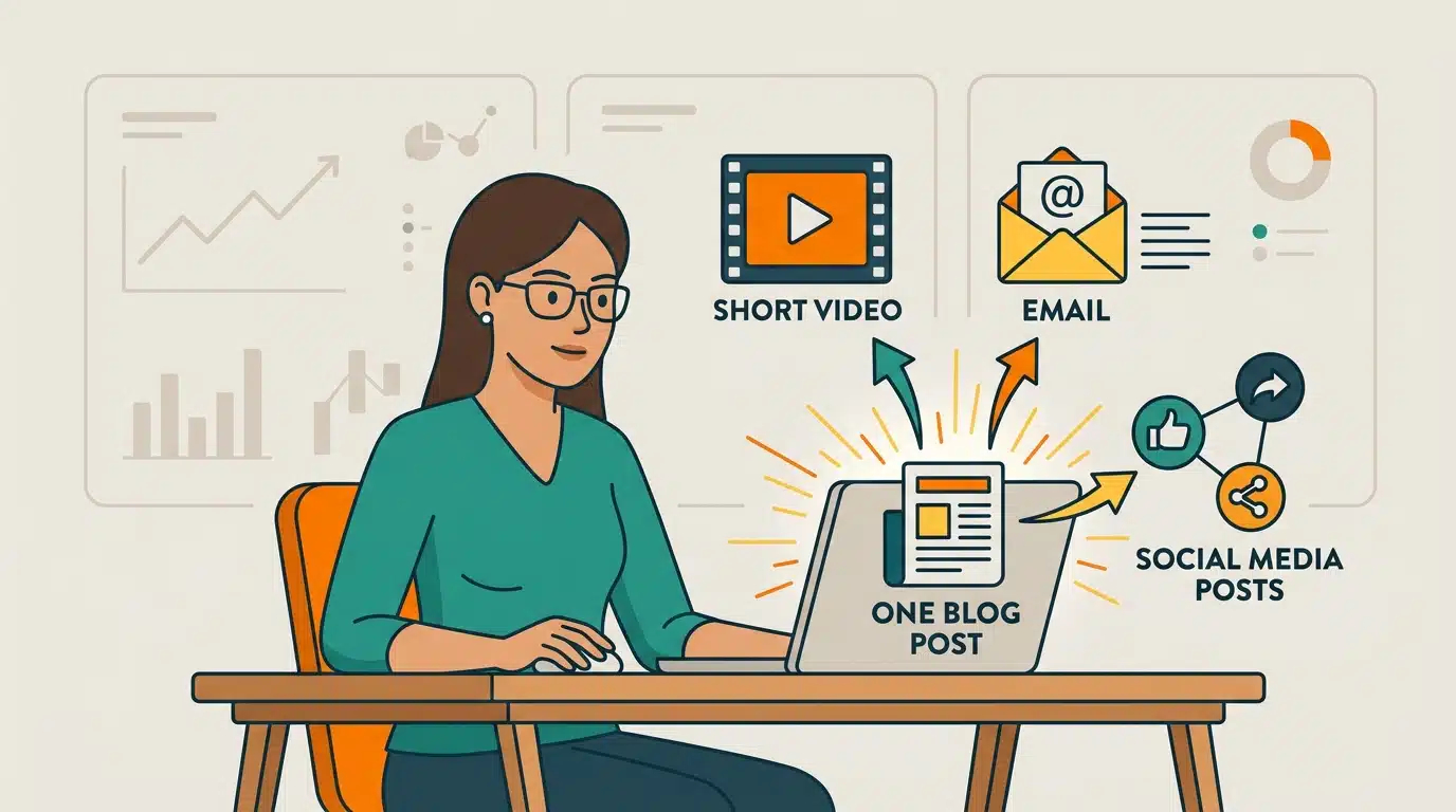
10 Smart Ways to Repurpose and Promote Your Blog Content

• Author: Stacy Jackson

• Published: June 15, 2026

• Category: Content Marketing

The B2B Mix Visual & AI Content Guidelines This guide is for designers, freelancers, admins, and anyone creating visual assets for The B2B Mix. Use it to create blog graphics, social media images, and AI-generated visual content that aligns with the brand. The goal is simple: when someone sees these visuals, they should feel consistent, recognizable, approachable, and clearly connected to the brand. 1. Start Here: What The Brand Should Feel Like The visual style for The B2B Mix is not highly technical, cold, or diagram-heavy by default. Instead, Visuals for the brand should feel: Friendly Human Smart Clear Modern Slightly playful, while still professional A good way to think about it is: The brand uses illustration to show people interacting with ideas. That means most visuals should feel like a business moment rather than a technical diagram floating on a screen. Good fit for the brand A team reviewing performance data together A marketer working at a laptop with dashboard elements visible A person presenting strategy to a group A collaborative scene with subtle charts, graphs, or workflow elements in the background Not a good fit for the brand Overly technical infographics with no human element Stiff corporate visuals Generic stock-photo-looking illustrations Busy visuals with too many floating icons or disconnected concepts If a visual feels too technical or too corporate, it is probably off-brand. 2. The B2B Mix Core Visual Style Overall art direction Use a flat, modern vector illustration style. The preferred illustration style includes: Clean outlines Slightly rounded shapes Friendly, expressive characters Modern professional settings Simple business scenes with light visual storytelling These visuals should feel polished, but not sterile. The best creative formula for the brand When in doubt, use this formula: People + business action + subtle data context That means: People are usually the focus Business activity gives the scene meaning Data, dashboards, charts, or workflow elements support the idea in the background or on screen The chart or data element is usually there to support the story, not become the entire story. 3. Color Palette: Use Only Approved Brand Colors All visuals must strictly use The B2B Mix brand palette. Approved colors Deep Teal: #254653 Teal: #2a9d8f Orange: #fc7e01 Yellow: #ffcc3f Light Neutral: #eae4dd How to use the colors Use Deep Teal for primary backgrounds or strong anchor elements Use Teal for clothing, charts, interface elements, and secondary visual structure Use Orange for emphasis, warmth, energy, and focal accents Use Yellow for highlights, contrast, small details, and visual energy Use Light Neutral for screens, paper, backgrounds, and breathing room Important rules Do not introduce off-brand colors Orange and yellow should be used as accents, not dominant full backgrounds in most cases Keep contrast strong enough for readability Color in The B2B Mix brand is not only for hierarchy; it also creates warmth and personality 4. Typography Inside Visual Assets If text appears inside the image, use the following brand fonts: Headlines: Quicksand Bold Supporting text: Lato Regular Text styling rules Keep text minimal Use short phrases, labels, or stat callouts Avoid long paragraphs inside graphics Make sure all text is readable at smaller sizes, especially on mobile and social platforms Alignment Left-aligned or center-aligned both work Choose the option that keeps the layout clean and balanced Text color Primary text should typically be white or light neutral Important keywords may use orange or yellow for emphasis 5. Composition: How the Images Should Be Built The strongest visuals for the brand usually follow this structure: Signature composition pattern Foreground: people, action, collaboration, presentation, analysis Background: charts, dashboards, boards, screens, office context, simple visual cues This is one of the clearest patterns in the preferred blog image examples. Composition rules Use one clear focal point Do not overcrowd the image Support the message with 2–4 secondary elements max Leave enough open space for the eye to move comfortably Make the image work both at full size and reduced thumbnail size Overall balance The illustration should support the message without becoming cluttered or chaotic. Visuals should feel confident and clear, not busy. 6. Preferred Image Style for Blog Graphics For blog artwork, the preferred style is usually scene-based concept illustration. Best blog hero style Use illustrations that show: Teams collaborating People reviewing analytics Someone presenting strategy A marketer or consultant working with data A professional setting that visually connects to the article topic Important note Do not default to creating a workflow diagram, chart, or framework image unless the article specifically needs one. Blog artwork for the brand often works best when it feels like a visual story moment, not a technical explanation. Supporting blog images When supporting graphics are needed inside a post, use these in order of preference: Scene-based illustration Simple dashboard-style visual Light workflow or framework visual Even when using a diagram, keep it visually friendly and on-brand. It should feel like it belongs in the same world as the illustrations. 7. Preferred Image Style for Social Media Graphics Social images for the brand should be built for quick understanding and scroll-stopping impact, but they should still feel unmistakably aligned with the brand. General social media approach Social graphics for the brand should be: Bold Clear Visually clean Human-centered when possible Easy to understand in a few seconds Social formats to prioritize 1080 x 1080 for standard square social posts 1080 x 1350 for taller social graphics and carousel slides Recommended social image types A. Illustrated insight post Use a simple illustrated scene plus a short headline or key idea. Example direction: Team reviewing campaign performance Short message overlay Strong contrast and clean layout B. Carousel post Use for educational content. Structure: Slide 1: strong hook Slides 2–5 or 2–6: key points Final slide: summary, CTA, or takeaway C. Stat graphic Use a large number or data point, but support it with illustration or visual context. Do not rely on plain text-only designs unless necessary. D. Thought leadership graphic Use one strong idea paired with a scene, character, or visual metaphor. Social design rules Keep copy short Use one core message per graphic or per slide Avoid cramming too much text onto one image Keep human presence whenever possible Avoid generic motivational quote styles unless clearly adapted to the brand’s illustration style 8. Repeating Scene Types to Use Again and Again To keep visuals consistent across the brand, there are three scene types that work especially well for this brand. Designers and admins should reuse these often. 1. Team collaboration scene Examples: Group around a laptop Team reviewing charts together Shared conversation about strategy or performance 2. Presentation or teaching scene Examples: One person presenting to a group Whiteboard or screen in the background Charts or workflow visuals visible behind the presenter 3. Individual analysis scene Examples: One marketer at a desk reviewing a dashboard Person analyzing reports on screen Solo expert or strategist working through insights These three scene types are the safest, strongest starting points for your brand. 9. Mood and Tone Every visual should reinforce the tone of the brand. Images for the brand should feel: Professional but warm Solutions-oriented Positive and intelligent Helpful rather than flashy Even when a visual is meant to show a challenge, the mood should still feel constructive. For example: If showing confusion, also hint at clarity or resolution If showing a problem, make the overall tone hopeful or forward-moving Avoid visuals that feel gloomy, overly dramatic, or cynical. 10. What to Avoid Please avoid the following unless specifically directed otherwise: Photorealistic or 3D-generated styles Cold, highly technical infographic-first layouts Complex diagrams with too many steps or labels Generic corporate stock illustration styles Off-brand colors Cluttered compositions with too many floating symbols Visuals with no clear focal point Text-heavy graphics with too much copy 11. AI-Generated Image Guidance If you are using AI tools to create illustrations, do not begin by prompting for diagrams or infographics unless that is specifically needed. The best default prompt direction for this brand is: A friendly business scene with people, supported by subtle data or dashboard context. Prompt starter: general brand-safe image "Create a flat vector illustration in a modern B2B editorial style for The B2B Mix. Show a friendly, professional business scene with people collaborating around a laptop or presenting strategy, with subtle charts, dashboards, or graphs visible in the background. Use only these brand colors: #254653, #2a9d8f, #fc7e01, #ffcc3f, and #eae4dd. Use slightly rounded shapes, clean outlines, and a warm, smart, approachable tone." Prompt starter: team collaboration scene "Create a flat vector illustration of a modern B2B marketing team collaborating around a laptop, reviewing analytics together. Include subtle charts or dashboard elements in the background. Use a friendly, polished editorial illustration style and only these brand colors: #254653, #2a9d8f, #fc7e01, #ffcc3f, and #eae4dd." Prompt starter: presentation scene "Create a flat vector illustration of a business professional presenting strategy to a small team, with charts, graphs, or a simple workflow visible on a screen behind them. Use a modern, friendly, professional B2B illustration style and only these brand colors: #254653, #2a9d8f, #fc7e01, #ffcc3f, and #eae4dd." Prompt starter: individual analysis scene "Create a flat vector illustration of a marketer or consultant analyzing a dashboard at a desk, with charts visible on the screen and a clean modern business environment. Use a warm, smart, editorial illustration style and only these brand colors: #254653, #2a9d8f, #fc7e01, #ffcc3f, and #eae4dd." AI image rules Keep the style flat and illustrated Keep the people central when possible Use data visuals as supporting elements Do not allow the output to drift into photorealism or 3D Reject anything that looks like generic stock art Negative prompt ideas no photorealism no 3D render no off-brand colors no cluttered composition no corporate stock-photo style 12. AI-Generated Video Guidance If you are using AI video tools, the same visual principles apply. Videos for the brand should feel like animated versions of the illustration style. Best-fit video style Flat vector style Clean, modern motion Light animation Friendly and professional Short, clear, and easy to follow Preferred video format 1080 x 1080 is preferred unless otherwise directed Suggested structure Hook 3–5 short supporting scenes Summary or CTA Motion guidance Use subtle movement such as: Fade in / fade out Slide transitions Small chart animation Light character or icon movement Avoid overly cinematic effects or complex motion graphics unless specifically requested. Prompt starter: general brand-safe video "Create a 1080x1080 AI-generated video in a flat vector editorial illustration style for The B2B Mix. Show a modern B2B marketing team collaborating and reviewing data, with subtle dashboard and chart elements. Use only these brand colors: #254653, #2a9d8f, #fc7e01, #ffcc3f, and #eae4dd. Keep the animation clean, warm, friendly, and professional, with simple transitions and light motion." Prompt starter: slideshow-style video "Create a 1080x1080 slideshow-style video in a flat vector illustration style for The B2B Mix. Use 4 to 6 scenes showing a modern business team collaborating, presenting ideas, and reviewing performance dashboards. Use only these brand colors: #254653, #2a9d8f, #fc7e01, #ffcc3f, and #eae4dd. Keep motion simple and the overall tone smart, approachable, and polished." 13. Blog and Social Templates These are the standard visual templates to use as starting points. Blog template 1: scene-based hero image Use for: most blog posts Structure: One main business scene People are central Data or charts appear on screens or in background Composition is simple and readable Best for topics like: strategy analytics teamwork marketing planning RevOps campaigns Blog template 2: supporting dashboard visual Use for: articles focused on metrics, measurement, reporting, or results Structure: Simplified interface or screen view 1 person or no person, depending on need Clean chart hierarchy Blog template 3: light framework or workflow visual Use for: articles that truly require step-by-step explanation Structure: Simple flow Minimal labels Same brand illustration style Social template 1: illustrated insight graphic Use for: quick thoughts, takeaways, thought leadership Structure: Short headline One central illustrated scene or character moment High contrast and strong focal point Social template 2: educational carousel Use for: tips, steps, frameworks, and repurposed blog content Structure: Slide 1: hook Slides 2–5 or 2–6: supporting points Final slide: takeaway or CTA Social template 3: stat graphic Use for: data-backed claims or performance content Structure: Large stat Small supporting label Illustration or data context behind or beside the stat Social template 4: CTA or promo graphic Use for: lead magnets, webinars, blogs, offers, and announcements Structure: One core message One supporting visual scene Clean space for CTA language 14. Final Creative Check Before finalizing any asset, ask: Does this look like The B2B Mix? Does it feel human and approachable? Are people or story moments included where appropriate? Are the colors strictly on-brand? Is the image clear at a glance? Does it feel polished without becoming stiff or overly corporate? If the answer to those questions is yes, the asset is likely on the right track. Final Summary The B2B Mix visual style should help someone immediately feel that the brand is: smart clear warm modern helpful The best shorthand for creating visuals is this: Show people interacting with ideas, not just diagrams explaining them. That is the clearest path to creating brand-ready assets for The B2B Mix blog, social media, and AI-generated content.

You spent two weeks on that blog post. You researched it, fought with the headline, found an image that didn't scream "stock photo," and hit publish. Then you shared it once on LinkedIn, watched it pull in four likes (two from coworkers), and moved straight on to the next one.

Sound familiar?

If you're the person who owns content at a smaller B2B company, you already know the treadmill. There's always a next post. The pressure to keep the blog fed never lets up. And somewhere in there, the work you already published just… fades.

Here's the part nobody tells you: the answer usually isn't more posts. It's getting more out of the ones you've already made.

You're not imagining the pressure, by the way. In HubSpot's 2026 State of Marketing report, 83.5% of marketers said they're expected to produce more content, and over a third said much more, usually without more time or people to do it. So if it feels like a lot, that's because it is a lot. The good news: repurposing and promoting what you've already made is one of the smartest uses of a small team's limited time, and it landed as a top-five marketing trend for 2026. (Translation: you're not behind. You're right on time.)

Let's get into it. Ten ways, split into two buckets: getting more formats out of a post, and getting more eyes on it.

Part 1: Repurpose it (one post, many formats)

1. Cut it into short-form video

Short-form video is the format marketers say drove the biggest ROI in 2026, and you don't need a studio to play. Talk to your phone camera for 60 seconds about your post's main point. Or record a quick screen-share walking through one tip. One blog post can easily become three or four clips.

(Camera-shy? Same. A simple text-on-screen video with a voiceover counts. Done beats perfect.)

2. Break it into single-point social posts

Your post probably makes five or six points. Each one can be its own social post. A "10 ways" list like this one? That's potentially ten posts, or one carousel, from a single article.

One rule, though: don't copy-paste the same blob everywhere. HubSpot's 2026 data found that about half of marketers reuse content as-is across platforms, but their own guidance is that tailoring it to each channel works better. LinkedIn isn't your email list isn't a Reel. Same idea, adjusted for the room.

3. Fold it into your newsletter

If you've got an email list (you do, right?), your blog post is newsletter fuel. Don't paste the whole thing. Pull the one insight that's most useful to your subscribers, write a couple of sentences of setup, and link to the full post. Your most engaged audience already raised a hand to hear from you. Start there.

4. Turn the how-to into something downloadable

Got a step-by-step post? Turn it into a one-page checklist, a template, or a simple cheat sheet. Now you've got something people will actually trade their email for, which means your content stops being a one-time read and starts building your list. (This is also the quiet moment where "content" turns into "content that's connected to something." More on why that matters another day.)

5. Pull the questions into standalone Q&A

Every good post answers questions. Mine yours, and turn each answer into a short standalone piece: a quick LinkedIn post, an FAQ on a page, a snippet for your help docs. Bonus: this is exactly the kind of clean question-and-answer content that AI search tools like to quote. (We'll come back to that in #10.)

Part 2: Promote it (more eyes, more often)

6. Email your list first

Before you do anything clever, send it to your list. These are the people most likely to read, click, and share it. Promotion that starts with your owned audience beats promotion that starts with strangers on a feed.

7. Pick your 2–3 channels and post on purpose

You do not have to be everywhere. (You especially don't have to be everywhere when you're a team of one.) Pick the two or three places your actual buyers spend time, and show up there consistently. Three channels done well will out-perform seven channels done sloppily. Every time.

This is the SEO move most small teams skip. When you publish, add internal links from your new post to related older posts, then go back and add links from those older posts to the new one. It helps readers find more of your work, and it helps search engines understand how your content fits together.

9. Refresh and re-promote your old winners

Some of your best content is already sitting on your site, slowly going stale. Find the posts that once did well, update the examples and the stats, and promote them again like they're new (because to most of your audience, they are). If you've never taken stock of what you've already published, start with a content inventory.

Yep, that's exactly what this post is. The original went up years ago, the advice held up, the stats didn't, so here we are. Practice what you publish, right?

10. Structure it so AI search can quote you

Here's the newer one. People aren't only Googling anymore. They're asking ChatGPT, Perplexity, and Google's AI answers, and those tools pull from content that's easy to extract. About 40% of marketers are already updating their SEO approach for AI-powered search, per HubSpot's 2026 research, so this isn't a someday thing.

A few moves that seem to help (and yes, this space is moving fast, so treat these as current best practices, not gospel):

  • Answer the question right away. Put a clear, direct answer near the top of each section, then explain. AI tools grab the clean answer.
  • Use real questions as headers. "How do you promote a blog post?" is more quotable than "Promotion Strategies."
  • Keep your facts checkable. Cite your sources, use real numbers, and skip the vague filler. AI engines (and humans) trust specifics.
  • Add FAQ structure. A short FAQ section, marked up properly, hands both search engines and AI a tidy set of question-and-answer pairs to pull from.

The actual takeaway

You don't need to write more. You need to wring more out of what you've already made.

Pick two or three of these for your next post. Cut a video, slice it into social, refresh an old winner. Then build it into your routine so it stops being a heroic one-time effort and just becomes how you work.

And if part of your mix is sharing other people's work with your own point of view (a genuinely low-effort promotion tactic, when it's done well), here's how to curate content without turning into a link dumper.

Your content already did the hard part. Go make it work twice as hard. (Or, you know, ten times.)

FAQs

What does it mean to repurpose blog content?

Repurposing means turning one blog post into other formats, such as short videos, single-point social posts, an email newsletter segment, a downloadable checklist, or standalone Q&A, so you get more value from work you have already done instead of starting from scratch every time.

How do you promote a blog post?

Start by emailing your list, then share it on the two or three channels where your buyers actually spend time. Add internal links to and from related posts, and periodically refresh and re-promote strong older posts so they keep working.

Is repurposing content good for SEO?

Yes. Repurposing creates more entry points to your ideas, and internal linking between related posts helps search engines understand and surface your content. Refreshing and re-promoting older posts can also improve their rankings and traffic.

How do you optimize blog content for AI search (AEO)?

Answer the question directly near the top of each section, use real questions as your headers, cite specific sources and numbers, and add a structured FAQ section so AI search tools can easily extract and quote your content.

Stacy Jackson

Stacy Jackson is co-founder of The B2B Mix®, a HubSpot operations partner for small and mid-sized B2B companies. She specializes in advanced HubSpot workflows, customer journey orchestration, and the kind of marketing reporting that actually answers questions. Her focus is helping marketing teams capture, score, and route leads to sales through smart automation — so the right people get the right message at the right moment, without anyone having to manually babysit the process. Find her on LinkedIn.

The Mix Monthly

One email a month. Field notes, frameworks, the occasional rant. No spam. Unsubscribe anytime.